Have the soup.
That is the funniest thing I've seen in weeks.
Gears of War.
Gears of War is a towering monument to contemporary gaming, and not only for the obvious reasons. As Microsoft has
made clear1, this game is both their answer to the PS3/Wii threat, and their sole must-have for 360 gamers this holiday season. Available in both premium and regular versions (just like the 360 itself), the game arrived on shelves perfectly timed to remind everyone that Microsoft loves you, baby, and there are plenty of 360s on store shelves for everyone. And in terms of such marketability,
Gears is wholly contemporary: arguably more flash than substance. But that's not really the whole story;
Gears is also fashionable in its attempts at genre fusion, blending elements of FPS, stealth, old-is-new-again linear level design (thanks,
Valve), and third-person adventure. But does it work? .. Well, it depends on how modern
you are.
Created by longtime PC game developer Epic,
Gears was birthed for "only"
$10 million, which really ain't bad
considering. This cost savings was apparently achieved largely via reuse of Epic's own Unreal Engine, and of course by
outsourcing the game art
2.
China's artists are worth every penny, though, because
Gears of War looks fucking nice. This is particularly true on an HDTV, of course (and
Gears supports up to 1080i), but I am thrilled to report spectacular results even on a regular ol' standard-def set. None of the buzzkills of years past –
LOD / mipmap weirdness,
pop-up,
clipping-plane fog – make an appearance, and the graphical whizbangery actually improves gameplay in the sense that distant enemies remain clearly visible at all times. And hey, the text is legible! Can't always take that for granted. But even more interestingly,
Gears manages to avoid the
uncanny valley effect which is beginning to appear in
more and
more games. I believe this is achieved through subtle, comic-book-style
exaggeration of facial proportions, features, and textures. Whatever the method, it works.
But what screen shots of the game can't tell you is that the frame rate, although generally acceptable, has some problems. In single-player the dips are fairly rare outside of cutscenes, and 30fps is the general rule. But in split-screen co-op, which as I will describe in a moment is the only way you want to play
Gears of War anyway, there are more widespread frame rate issues. This will hardly surprise fans of split-screen gaming, but that it occurs at all is a curiously last-gen sort of frustration to emerge in a game otherwise free of legacy baggage. To be fair, though, it's never really much of a problem
3.
Gears has also been cited as a standout in the audio department, but here I must strenuously disagree. For various reasons I tend to listen very carefully to games, and playing
Gears of War in 5.1 surround was not the revelatory experience I was led to expect. Gamespot called the sound effects "
killer;" IGN, "
virtually flawless." This is trivially untrue. Firstly, the music is thoroughly generic: you get action-movie music or creepy music, depending on the level, with battle music stitched in where appropriate. It works, sure, but it's no
Metal Gear Solid. They won't be moving many soundtrack CDs for this one. The real problem, though, and it's a big one, lies with the sound effects, or rather the effects engine. The effects themselves I have no real opinion on either way – I agree with IGN
4, but don't consider the agreement to be tacit approval as they do.
The problem with the sound effects engine is that it has screwed-up notions of precedence, if indeed it has any. By precedence I mean this: audio rendering engines usually set a limit on the number of sound effects they can play simultaneously. When there are more sounds to play than there are slots available, the audio engine needs to choose which ones play and which don't. This is often done via some precedence system, e.g. "play the sound of the enemy creeping up on you, instead of the background music." In
Gears of War, it fairly regularly happened that my firing machine gun would suddenly stop making sounds until I released the trigger and pressed it again. I could see from the gun on the screen that it was firing, but the sound stopped playing. Even when the scene became quiet again, the gun noise didn't come back until I released the trigger and pressed it again. Call me picky, but I found it an extremely irritating glitch and would consider it grounds for DQing a game from audio awards. This tradeoff hasn't been so poorly handled by a game in many years.
Okay, you say, but esoteric bitching aside, is the game any fun? Why sure. The basic game mechanics are easily expressed as:
Run into new area.
Take cover.
Pop out and shoot bad guys.
Run to next area.
But it really works, and it's where the primary innovation in
Gears takes place.
The control scheme centers around the A button, which is context-sensitive. It's a bit fiddly at first, but when you get used to it it works very well, and the game mechanics are impressively innovative in their fluidity when you learn to disambiguate your A button inputs. Said button is primarily used to take and break cover behind various objects, be they interior walls, heaps of garbage, cars, pillars, etc. From behind cover, you can either fire safely but blindly around the object, or pop partially out in order to aim with a crosshair. Popping back behind cover allows you to reload and regenerate your health (
Gears uses a regenerative health system; you only die if you take a lot of damage in a short period of time. It works), and the third-person view allows you to still see what the enemy is doing. To break cover you also use the A button, but pressing it in conjunction with a movement direction produces different effects: holding Up vaults your character over the cover if it's a low wall, and holding Left or Right performs a lateral roll that can provide a quick getaway or new cover in some situations. The take/break cover mechanic is the most important component of the
Gears of War gameplay, and it works well to provide both tension and time to strategize. Since the enemies are hiding behind objects as well, flanking tactics and grenades are more effective tools here than in many other similar games.
And that's really how
Gears progresses: set piece to set piece, both in large courtyard-like areas and in close quarters. The pacing is more
Half-Life than
Halo, but it never drags. The level design and enemy placement are well-done, and definitely highlights of the game.
Which is good, because they largely mask the borderline AI. As mentioned above, the enemies do a pretty good job of using cover and working together, but there are still plenty of moments of stupidity
5. Enemies regularly charge you, weapon holstered, and seem to love nothing more than clambering over boulders as you pump round after round into 'em. The kamikaze approach is disappointing, certainly, but you tend to dismiss it at first, because, hey, maybe that's how they fight.
A few minutes later you realize your squadmates are doing it too. Yes, you spend the game fighting alongside either one or three AI teammates. Argh. And yes, you have to revive them when they die. Argh.
This is why the game is primarily worth playing in co-op. In co-op your mandatory squadmate is controlled by player 2, and not that player 2 isn't a totally cool guy and stuff, but it's a relief just to have another person around to
not jump into bullets. That, and it's much more rewarding to apply some strategy to the situation when you know your squadmates will actually go along with the plan. It makes the game much more interesting, much more involving, and much more fun.
To reiterate:
split-screen co-op makes everything better. Not that this is anything new, but there you go.
Gears gets major kudos for this more than anything else. CliffyB, I salute you.
The plot, incidentally, is pointless both in its presence and its development. Your character is a generic badass, and the cutscenes are completely forgettable. The voicework is pretty nice, I'll grant, but on the whole you've already heard this story before, when it was called
Quake II. But anyone familiar with the genre already guessed that, so it makes precisely zero difference in the end.
Speaking of the end,
Gears of War is divided into five acts, for a total of 7 hours of play on the default difficulty ("casual"). If you find this to be a shockingly short play time, well, you're not alone, but the higher difficulty levels are indeed significantly tougher if you're into that sort of thing. Otherwise, though, there's always the
hugely popular multiplayer on XBox Live, which I was completely unable to figure out how to use (kept popping some strange error message). But I gather it's a good time.
How best to sum up
Gears of War? Well, I agree with
Eurogamer's closing thoughts:
"If you want to gorge on a next-generation audio-visual feast then Gears of War is a king's banquet. But what of the gameplay pudding that Peter Moore so often reminds us that he likes? The proof, he says, is in the eating, and in this case Gears of War sticks to a well-worn recipe."I completely agree. But whereas Eurogamer follows that sentence with a rating of 8/10, I follow it with mild disappointment. There's really nothing in
Gears gameplay-wise that exercises the 360, and aside from the graphics there's nothing here other systems couldn't do – the original XBox, for example, or even the original PlayStation. Contrast that with
Dead Rising, which introduces gameplay truly impossible to create before the 360. I can see how Microsoft sees
Gears of War as the current killer app for the 360, and certainly from a shock-and-awe perspective that's so. (
Just look at it.) But I suspect the postrelease hype and adoration is mostly a testament to the limited 360 software library right now. If you have the system, then
Gears of War is absolutely worth getting. But really, how many other options do you have?
1"Microsoft and Epic came together out of common interests a few years back. CliffyB was feeling trapped by the success of the Unreal franchise. And Microsoft, realizing that the delays of Halo 2 meant that there would be no Halo 3 for the Xbox 360 launch, needed a good game." The
article goes on to explain that Epic wanted to make the "Halo of XBox 2." How aspirational, sort of.
2Considering how much of game development costs go directly to art assets (especially in HD), this trend will only grow. Art students take note, and, uh, switch majors.
3Okay, it gets to be a bit irritating at the end of Act 2.
4"I've never heard a head explode or a chainsaw dismember someone, but I would imagine it sounds exactly like it does in Gears of War." And
etc. Let me say this: I have heard a head explode and a chainsaw dismember someone before. In practically every FPS since Wolf3D in 1992. And it has always sounded just like it does here.
5The huge blind enemies are particularly effective in demonstrating that games still have a ways to go in terms of pathfinding.
Bad Zune Rising.
The official Zune launch was Tuesday, November 14th, and as the dust now settles the prevailing opinion is revealed:
thar, she blows. Uselessly
restricted Wi-fi
1 and general DRM
crapitude have joined forces with unabashedly
consumer-hostile2 business tactics, producing what may just be Microsoft's least desirable piece of consumer electronics yet.
And yet, you might just want one. The Zune presents tantalizing possibilities for the Linux community – possibilities that most nerds either haven't yet realized exist, or that most nerds are purposely keeping quiet about until it's too late. Because the Zune is possible the best iteration yet of
what I was pining for back in January – a cheap, general purpose mobile platform.
It's no secret that, as
usual, Microsoft is
losing money on each Zune sold. A big screen and on-board wireless will do that. So that already appeals to the OMG MICRO$OFT crowd. Add in the ease with which current tools can be applied to the out-of-the-box Zune – already, there's a
disk mode hack, a
replacement hard drive hack, and a
wireless "hack" (of course the key to the city is
fast approaching as well) – and it's clearly just a matter of time before Microsoft ends up subsidizing another
home theater PC.
The difference is, this one might actually have mass-market appeal.
1 Although of course their implementation is
hopelessly inept and trivially hackable. It'd be evil, if it weren't so stupid.
2 "Each of these devices is used to store unpaid-for material (...) This way, on top of the material people do pay for, the record companies are getting paid on the devices storing the copied music." –
David Geffen. Although note, this payment does not legalize any stolen music you do have on there.
Needless indeed.

What does this spam even want me to do? Are they just trying to annoy us now?
Automator for the People.
Automator is one of those OS X features that everybody likes but nobody uses. This seems to surprise pundits, but anyone familiar with the history of GUIs should've seen it coming; because at its core, Automator is just another well-meaning but disappointing attempt to provide a drag-and-drop interface to a programming language. There's a lot of spit and polish, sure, but in the end Automator is still programming .. but with a mouse.
The
official explanation is of course more compelling:
"In Automator, you create workflows to automate whatever task you need done. (...) You add actions in sequence to your workflow until you've outlined the steps needed to accomplish the tasks you want done." And that is certainly the case: Automator uses a linked-list metaphor in order to break a complex task into smaller steps. Here's a screenshot of an Automator workflow that performs a fairly complex task:
Example workflow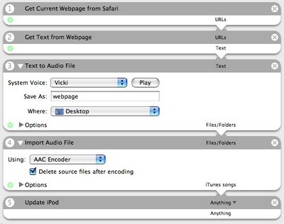
This workflow grabs the text from the web page I'm currently looking at, turns it into an audio file using text-to-speech, encodes it into AAC in iTunes, and syncs it to my iPod. Although I certainly agree that it's of borderline usefulness, this workflow nevertheless performs a pretty complex task – and I put it together from scratch in about two minutes just by dragging a bunch of actions into a list.
And that brings us to the big problem with Automator: the limited number of actions. Although most Apple applications include a wide variety of default actions, and although many third-party apps make an effort to at least provide some basic ones, the attitude for the most part is, "Well, if you need an action that isn't provided, you'll have to make it yourself."
As it turns out, I did need one that wasn't provided, so I decided to
make it. And what an ordeal it was, because creating an Automator action is definitely not as easy as using one. To create one, you need to:
1. Lay out a custom UI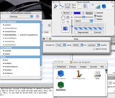 2. Write some Applescript
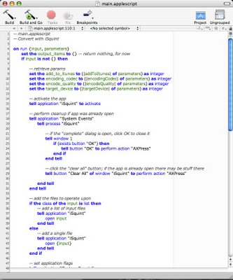 3. Edit the build target
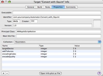 4. Edit the metadata
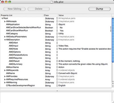
And then compile the code. Assuming it all works, you then get to flip the build config to Release and actually create a usable Action.
This is ridiculous. It took twelve hours! This is how I'd expect
developers to create actions, not users. And yet there it is, at the bottom of
this page:
"Expand your library by downloading new Actions from third-party developers or create your own using AppleScript." Yeah, right.
In contrast, another Tiger feature,
Dashboard, also has a steep development learning curve, but that difficulty is being addressed in the next OS release through a combination of
a dedicated development environment and a
drag-and-drop method for end users. Totally cool, and totally worthwhile. It'd be great to see a similar set of apps for Automator, or even just a more approachable XCode template.
Automator's a good idea, but its utility is directly proportional to the number of actions available. Users will make this app their own once they can create their own actions. Make it happen, Apple.
*AppleScript, for the unfamiliar, is a lightweight programming language in OS X most often used to "glue" different programs together. Its main claim to fame, aside from its incredible usefulness, is its English-like syntax. Here's an actual line of AppleScript code:
tell application "iTunes" to activate. Cool.
How Hard Could It Be, Part 6 (of 6).
Previous parts:
The algorithm we've developed works well for its original purpose, which was to locate a person in a webcam image, but it's also pretty robust in more difficult situations. Here are some examples, from situations with considerably more complex foregrounds and backgrounds:
Hand against a varied background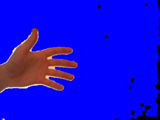
In this image, a hand is placed in front of a wall that varies from completely white (overexposed) on the far left to completely black (underexposed) on the far right. The hand remains whole and identifiable despite the brightness gradient behind it.
Forks on a table, soft light
Here, three forks lay on a table. The table is lit indirectly; soft shadows are cast. The algorithm captured the more complex outline of the forks pretty well.
Wires on a table, harsh light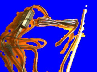
Here, some power cables and miscellaneous other crap lay on a brightly lit table. Notice that here the shadows become part of the foreground, since they darken the table's coloration and are picked up by the standard deviation algorithm*. Nevertheless, no wires are missed, and the amount of background brought into the foreground isn't too bad.
So this works, right? We're done! Well .. yes and no. Yeah, it works, but there's another part of the original problem we've overlooked: performance.
If you watched the
seminal Apple demo linked in part 1, you know that their background replacement occurs live, and at 30 frames per second. The algorithm we've developed here runs at .. 0.125 frames per second. That's 8
seconds per frame. Admittedly, it is written in Java (possibly the slowest environment I could've chosen), and it is a painfully sub-optimal implementation, but it's important to realize that the approach we've developed may be too slow for real-time applications. Certainly, the implementation I have right now is too slow.
Worried about this, I looked around to see if I could find a more optimal implementation of some of our ideas, and I was able to find an approach submitted to the
Iron Coder 4 competition a few weeks back. The winning entry, "Spacecam," implemented an approach that produces somewhat similar results to ours from Part 3:
Spacecam Part 3
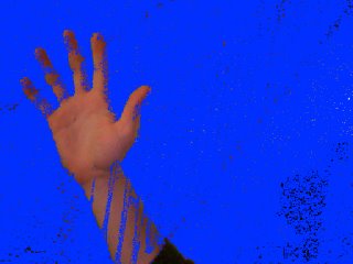
The interesting thing about this program is that it's implemented in Objective-C (the development language of choice on the Mac), and it makes use of the Core Image framework. (Core Image is a
super cool technology in Mac OS X that allows custom image processing to occur on the computer's video card – CS nerds take note.) Long story short, the Spacecam implementation, though neither optimal** nor especially analogous to our own, is a much more useful point of comparison than my Java implementation. And the Spacecam implementation runs at about 15 frames per second on my computer. Not 30, but much closer to 30 than 0.125. It seems to indicate that our implementation is, if not completely feasible, at least not wildly off the mark.
If I ever get around to learning Objective-C and implementing this approach in a more optimal fashion***, I'll be sure to revisit the topic. Otherwise, thanks for reading through the series. I hope it drew back the curtain a bit on some of the more magical things computers are doing these days.
* There are some
truly amazing algorithms for dealing with shadows, but they're beyond the scope of this series.
** To be fair, the Iron Coder participants compete to create finished software in 48 hours or less, so optimization is definitely not a priority.
*** Aside to CS nerds: the good news is that all our algorithms are easily parallelizable! The standard deviation, run-length, and morphological operations all operate on each pixel individually. The bad news, of course, is that each operates on the output of the previous operation, so the algorithms themselves must be applied sequentially. Still, though, that's not bad – and since each frame is treated independently, multiple frames can be processed simultaneously. Man, I'd like to do this up in Core Image.
How Hard Could It Be, Part 5.
(See past parts
1,
2,
3, and
4.)
After some initial trouble grasping a fundamental of image processing (specifically, that pixels taken in groups are much more useful than pixels taken individually), our home-grown statistical approach has worked out fairly well. The algorithms we've applied so far have done a nice job of finding and separating the foreground and background components of our noisy image. Really, the implementation we have just about fits the bill. Unfortunately, it just looks a little too home-grown.
Here's where we left off:
Current approach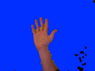
It'd be really nice if we could nail the transitions from background to foreground, so that the outline looks more natural. Right now it's pretty blocky and jagged. Certainly, it looks nothing like the Apple target:
Apple implementation
The white outline highlights the transition from foreground to background: that looks damned nice. Let's try to adapt our run-length approach, with a goal of creating a more natural outline.
As it turns out, the run-length implementation uses a similar technique to that described by common
morphological operators*. These operators generally work by overlaying a black-and-white shape on each pixel of an image, and flipping the pixel to be either black or white depending on how the image overlaps with the overlaid shape. This actually sounds pretty similar to run-length detection, doesn't it? With run-length detection we applied a 15-pixel run (the shape) to individual pixels in our image, and flipped all of the pixels in the shape between foreground and background depending on how the shape overlapped.
This should become more clear in a minute. For the morphological operators we'll be using,
erosion and
dilation, a circle tends to work well as the overlay shape.
The shape (a nine-by-nine pixel grid)
This shape will be applied to each successive pixel (the "target pixel") in the image, with the shape centered over each target pixel. Similar to the run-length detection algorithm, at each target pixel we'll count how many neighboring pixels in the image are both inside the circle, and foreground or background. We'll use those counts to determine whether to change the target pixel at the center to foreground or background. Specifically:
Erosion
For every foreground pixel in the image:
Place the circle over the target pixel, so the pixel is located at the center of the circle.
Count the number of foreground pixels inside the circle.
If every pixel inside the circle is foreground, keep the target pixel as foreground.
Otherwise, change the target pixel to background.
Dilation works similarly, but on background pixels:
Dilation
For every background pixel in the image:
Place the circle over the target pixel, so the pixel is located at the center of the circle.
Count the number of background pixels inside the circle.
If every pixel inside the circle is background, keep the target pixel as background.
Otherwise, change the target pixel to foreground.
That said, the effects of erosion and dilation are much more easily explained visually, so thanks to
Heriot-Watt University's CS department here are some images:
Erosion Dilation
As you can see, erosion tends to shrink the foreground (the white area), while dilation tends to grow it.
So! With the basics of erosion and dilation under our belts, we're almost ready to get programmin'. Before we do, though, there's One More Thing: how does this help?
What we'd like to do is create a sharp but natural outline around our foreground. In order to do this using our morphological operators, we need to apply them in the right sequence.
We'll first apply an "Open" operator, which is no more than an erosion followed by a dilation. The effect of an Open is to remove extraneous pixels from the foreground, pixels that don't follow the overall shape:
"Opening" operator
After performing the Open, we'll apply a "Closing" operator: a dilation followed by an erosion. The net effect of a Close is to fill in background holes inside the foreground:
"Closing" operator
So we'll first apply an Open (erosion, dilation), then a Close (dilation, erosion). The combination of these operators, in this order, should reduce foreground leak into the background, and background leak into the foreground.
All right. So what's it look like?
Final result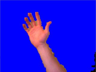
That worked. The artifacting and boxiness around the hand has been noticeably reduced. Here's a close-up of the fingers:
Close-up of final result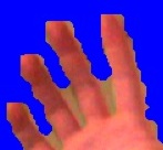
And by comparison, here's a close-up of the run-length detection alone:
Close-up of previous approach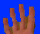
The hand is more clearly defined than it was under the run-length approach alone, and no new artifacts were introduced, so this is the point where I stopped. The final result was, in my eyes, close enough to the original solution that it seems only small tweaks and improvements would be necessary. The algorithms are generally sufficient. Next time I'll wrap things up by discussing the elephant in the room: performance.
* Big thanks to Jeff, incidentally, for originally pointing out morphological operators when my homegrown algorithms ran out of steam. This is what happens when you ask someone with background in the problem area.
Snow day!
Nothing worse than establishing a pattern only to break it, I know, but I misplaced some of my documentation for part 5. It'll be up tomorrow.
How Hard Could It Be, Part 4.
(This follows parts
1,
2, and
3.)
Okay, where do we stand? Our current implementation uses some basic statistics to try to separate the background of an image from the foreground. It accomplishes this by looking at each pixel individually, and deciding whether or not the pixel has changed enough that it couldn't have happened due to noise in the image. Such an approach looks like this:
Current approachReally, it isn't bad. But what we'd like is this:
Ideal case
So there's still work to do. In particular, the current attempt introduces a lot of fuzziness: many places are mixed background and foreground pixels, oftentimes alternating back and forth across a large area. It'd be great if we could reduce that fuzz, and produce more uniform areas of background and foreground. That'd look a lot more like the ideal case.
Here's a blown-up piece of the top image:
Close-up of finger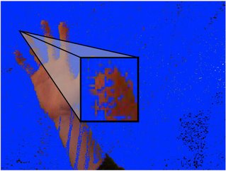
Ideally this would be a sharply defined and completely flesh-colored fingertip, surrounded by solid blue. But how could we create that? Well, maybe it'll happen if we can just reduce the fuzziness and get some sharp edges. We might be able to do that by looking at pixels differently: not as individual cases, but in groups.
The algorithm we'll use, which I completely made up, we'll call
run-length detection because it looks at a group (or "run") of fifteen* pixels all at once.
A run of pixels
Here's a strip of fifteen consecutive pixels from the zoomed-in area. What the run-length detection algorithm does is:
Starting at the top left corner of the image, look for a blue (background) pixel followed by a non-blue (foreground) pixel. Since this is potentially where the image switches from background to foreground, we'll try to reduce fuzziness in this area.
Count off the next thirteen pixels, to make a run of fifteen.
Count the number of background pixels in the run.
Count the number of foreground pixels in the run.
If there are ten or more foreground pixels, set all of the pixels in the run to foreground.
Otherwise, set all of the pixels in the run to background.
In the example above, there are nine background pixels and six non-background pixels. The algorithm will set all of these pixels to be background:
Setting all of the pixels as background
We'll apply this algorithm to runs both vertically and horizontally, in order to reduce detection fuzziness in both dimensions. And, we'll also try the run-length detection inverse: instead of looking for a
background pixel followed by a
foreground one, look for
foreground followed by
background.
After doing all this, the image looks like this:
Standard deviation + run-length detectionThat really worked. There's still some false positive in the lower right, where the black was so noisy that lots of foreground detection was produced, but the hand is so much more clearly defined that this algorithm still helped. It also cleaned up all of the blue showing through the arm and palm.
Things are looking pretty good: our image is getting close to the ideal case. The next thing to do is try to smooth out those sharp edges around the fingers, and try to make a more natural-looking outline around the entire limb.
* The run and threshold numbers were arrived at empirically, just by fiddling around for awhile.
How Hard Could It Be, Part 3.
(Also see parts
1 and
2.)
We're now at the point where we understand the problem, and are starting to think about solutions. Unfortunately, the simplest and most straightforward attempt at a solution has failed. By comparing each pixel of the background image to each pixel of the background-and-foreground image we hoped to figure out whether the pixel was background (the pixels are the same) or foreground (the pixels are different). What we didn't realize is that webcam images tend to be noisy, and the noise prevents that approach from working: because the noise causes each image we look at to have a slightly different color value for each pixel, a direct comparison doesn't work. What we really need is a way to compare pixels that:
Knows background pixels can vary a little bit but still be "just about the same," and
Also knows that too big a difference means the pixel has probably changed.
Put another way, we want to know when a pixel has changed enough that it can't possibly be part of the background anymore. Fortunately, there's a relatively easy way to figure that out. What we need to do is collect a bunch of different empty-background images, and then look at how much each pixel changes in each image. If we do that for a number of different images, we can get a good idea of how much the pixel's color is affected by noise.
Color of the same pixel in sequential images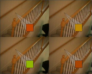
Those look like pretty different colors, but if we assume that those colors represent the extremes of how much the color can vary, we can figure out how much variation in color should be considered acceptable for the pixel to still be part of the background. We do this by calculating the
standard deviation. In essence, the standard deviation says:
If this pixel is between green and brown, it's probably still part of the background.
We can also then turn that statement inside out to say:
If this pixel isn't between green and brown, it's probably not part of the background.
That answers our question! Remember, we wanted to know when a pixel has changed enough that it shouldn't be considered part of the background anymore. Using the standard deviation*, we can tell when a pixel has changed enough that it's unlikely noise alone caused the change. Problem solved, right?
Well, let's try it. Here's what we get when we capture ten empty background images, calculate the standard deviation of each pixel based on those ten images, and then use that to determine whether each pixel in a live image is part of the foreground or the background:
Finding background pixels in a noisy image using the standard deviation
Hey, that's not bad! It doesn't get all of the pixels, but it gets most of 'em. Note that a big clump of the missed pixels are in the bottom-right corner of the image; that's because that corner is black in the image, and noise tends to be worse in darker areas of images because very little light hits the camera to tell it what color that area is.
Things are looking pretty good, so let's press on. What happens if we stick a foreground object into the scene?
Background subtraction using the standard deviationHmm, that doesn't look nearly as good. My hand is certainly visible, but there are all sorts of holes in my fingers, and the railing in the background is clearly visible through my arm. Looks like my skin color is so close to the color of the railing that the standard deviation thinks it sees background!
Tomorrow we'll look at ways to make the background and foreground more uniform, and see if we can't clean up that image.
* Well,
three times the standard deviation, to be precise.
